Virgin Money UK
Visual Design Work
A collection of some visual design work I’ve done at Virgin Money. The brand is bold, punchy, cheeky and bright, and everything starts with our hero colour red. Recently we introduced new design elements to our brand to include illustrations. I was part of a small team exploring usage and how we could lock them up and what colour combinations and shapes could be used.
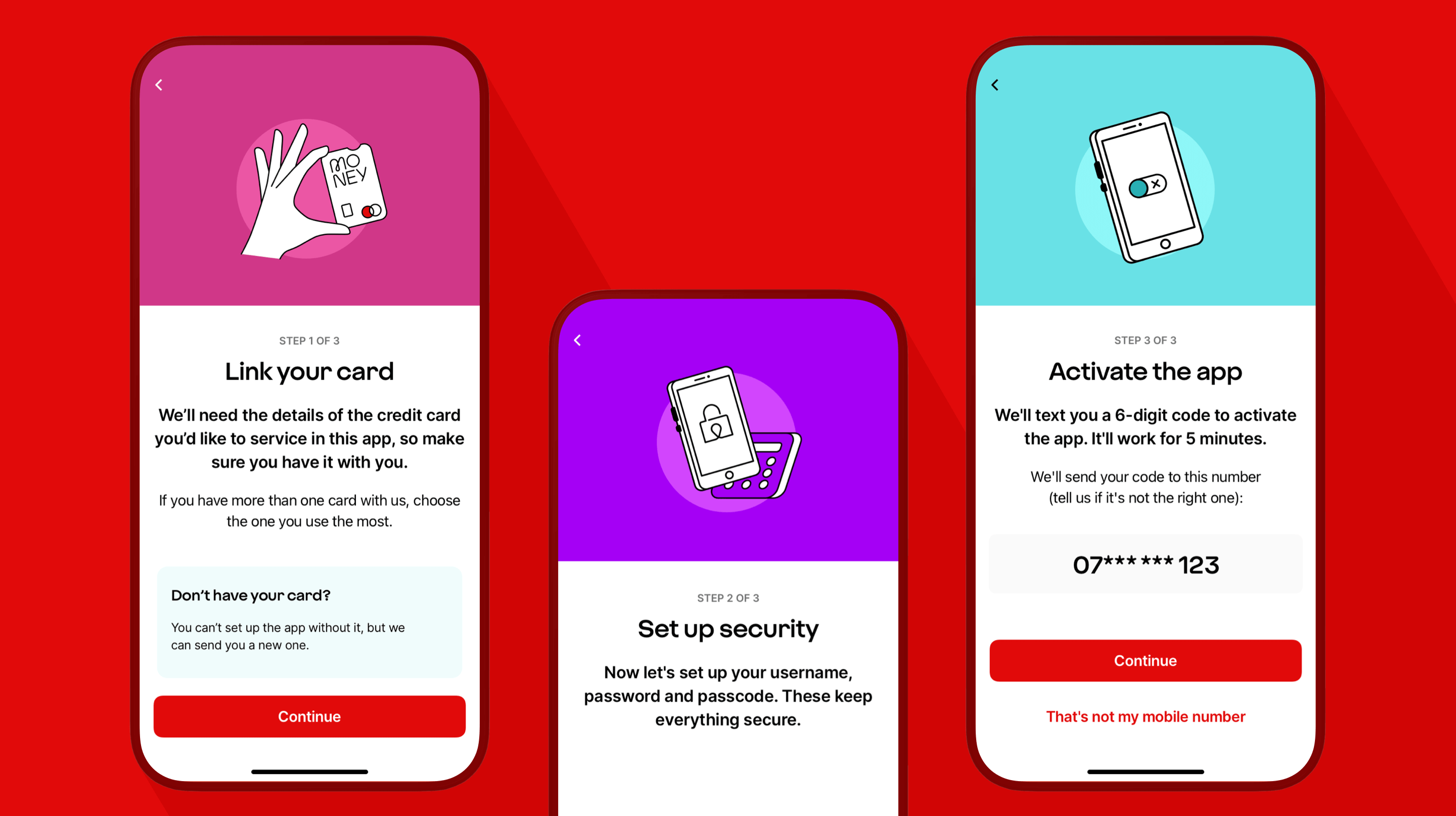
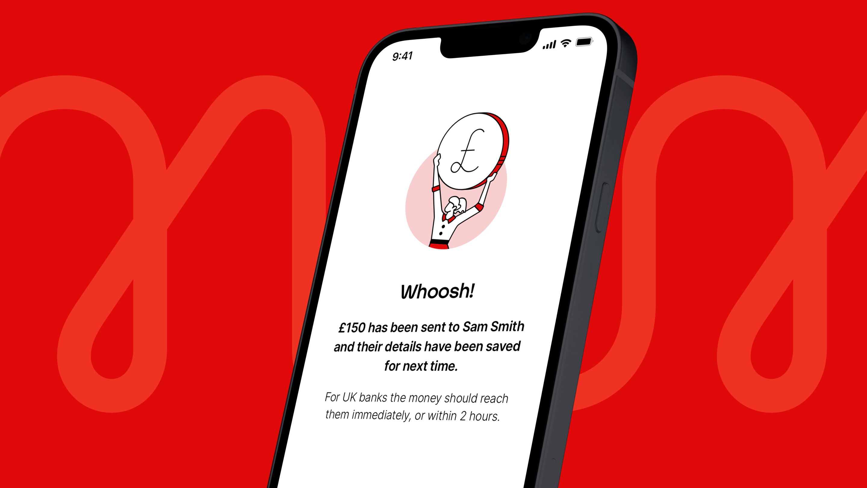
Above: creative design lockups utilising our new illustration design assets showing some partial in app journeys.
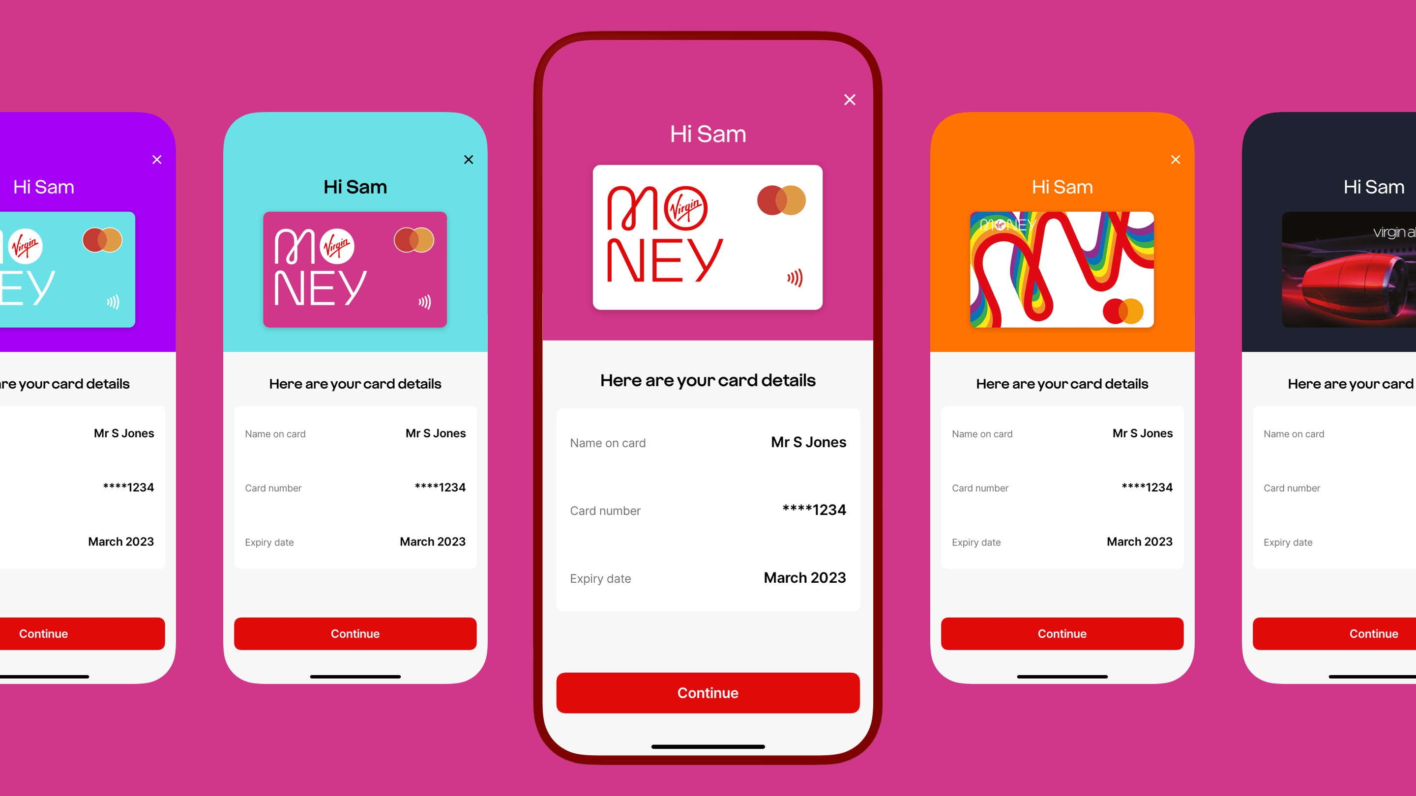
Above: card detail lockups, we are moving towards personalisation to match their card in app, as well as being able to choose their app icon which would feature icons to align with events such as pride month, Halloween and other festive holidays. With our aim to be delightfully surprising we’re also looking at giving app users the ability to select their pin using emojis instead of numbers.
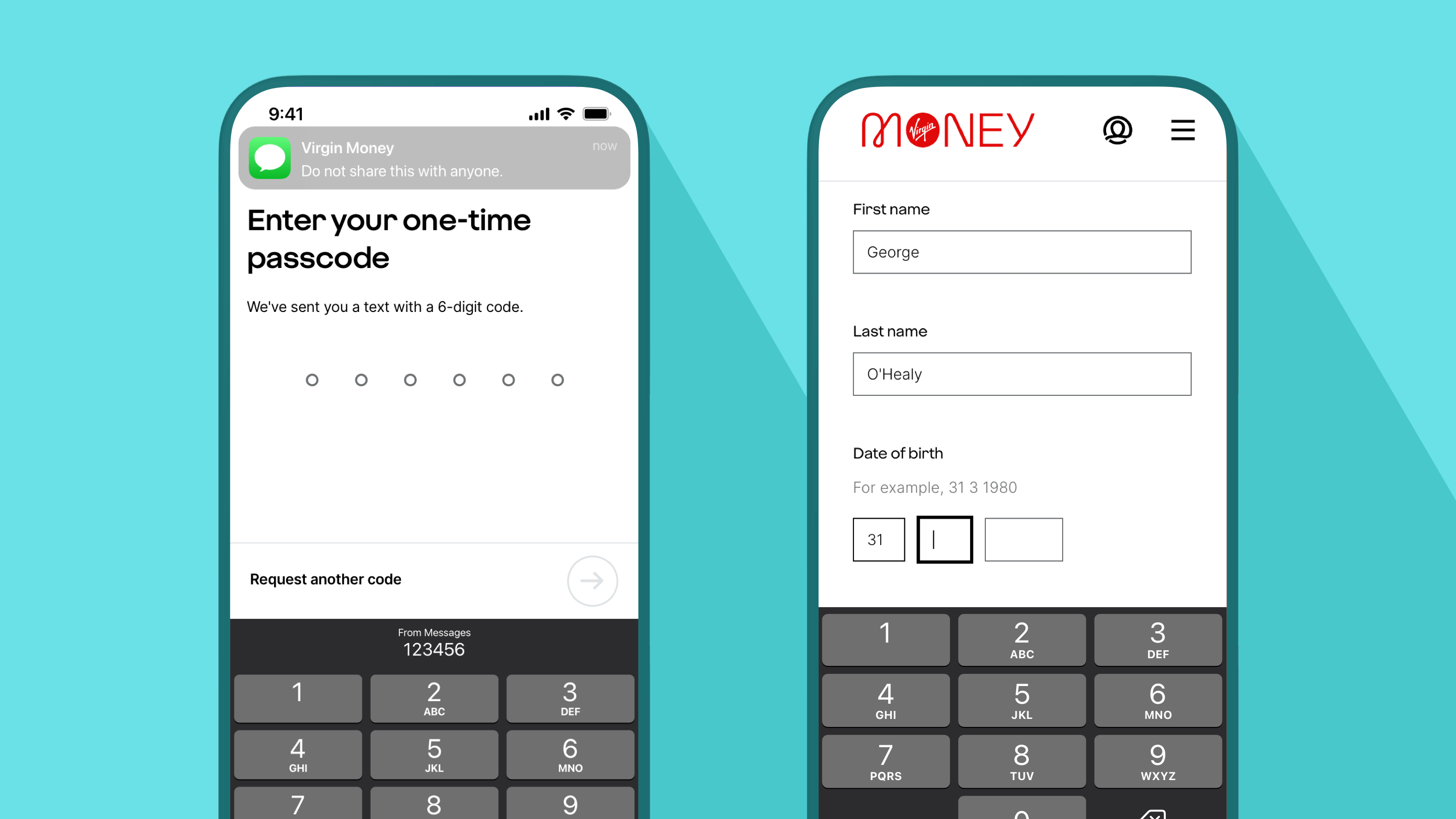
Above: An example of an OTP lockup with Apple’s keyboard code prompt, as well as dynamic keyboard which will switch between an alphabetical keyboard and numeric depending on the field the user is in.
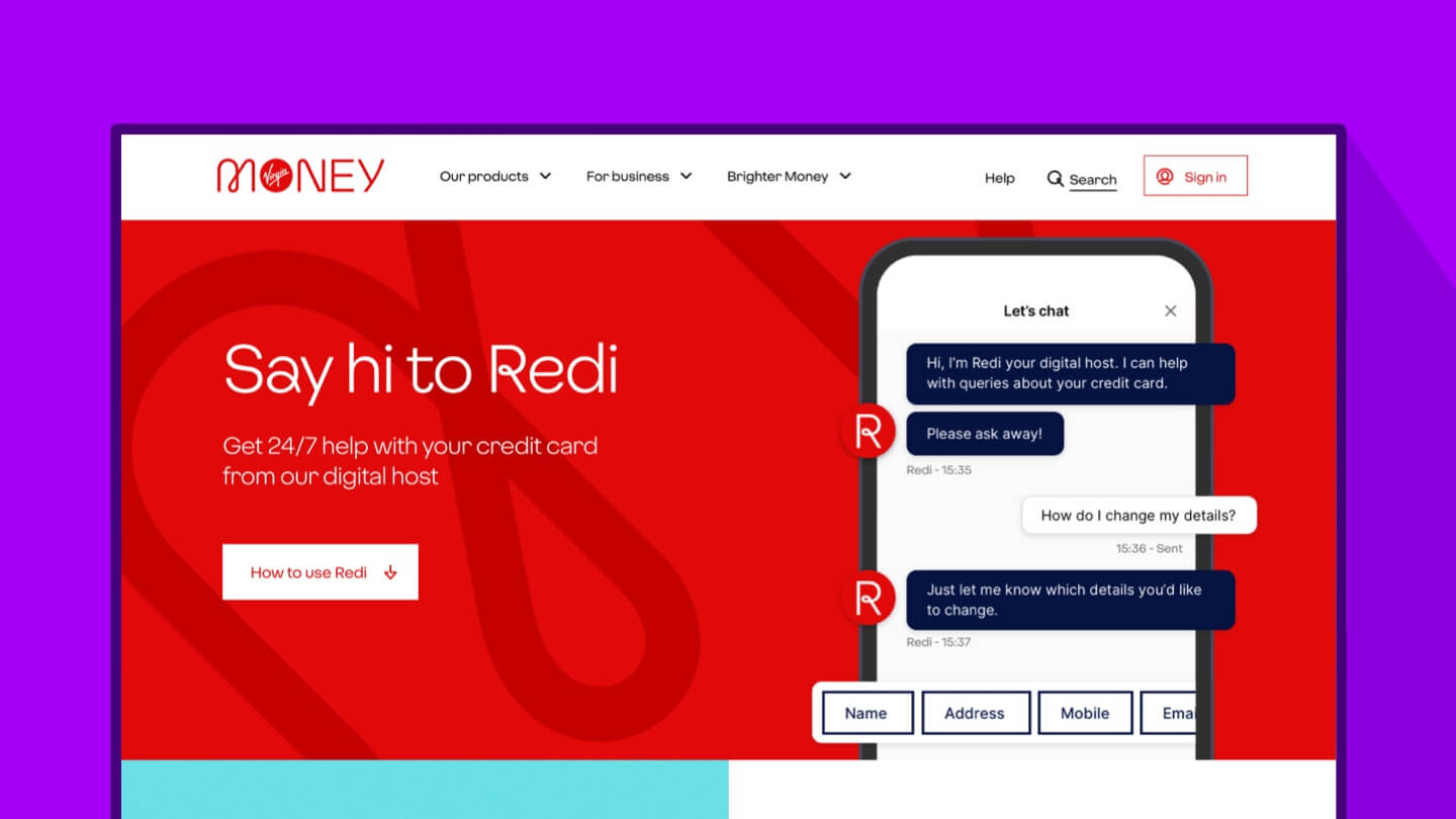
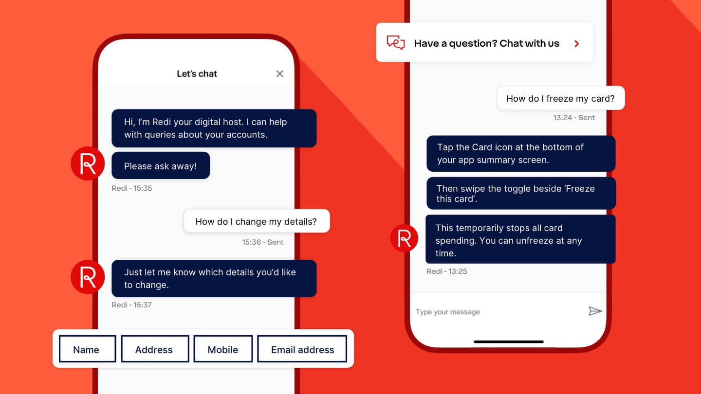
Above: One of my projects I was involved in was shaping our new chatbot, Redi. The above show some creative lockups overlapping the devices showing a chat as well as some buttons for selection.


Above: Instagram carousel lockups for educational content. These have been size optimised to maximise real estate on the platform by using 1350px x 1080px dimensions. A seamless scroll pattern has also been utilised to create a delightful seamless experience. Colour combinations used with our accessibility standards.