Virgin Money UK ISA Transfer digitisation
One of my projects at Virgin Money UK was to digitise some of our paper forms to drive one of the banks key goals of becoming the UK’s best digital bank.
An ISA is an Individual Savings Account which UK residents can deposit tax free savings up to £20,000 each year shielding it from income tax, tax on dividends and capital gains tax. There are four types of ISAs:
- cash ISAs
- stocks and shares ISAs
- innovative finance ISAs
- Lifetime ISAs
This form is used to transfer a Cash ISA from another provider to a Virgin Money Cash ISA, or transfer a Stocks and Shares ISA either from Virgin Money or another provider into a Virgin Money Cash ISA.
goals & OUTCOME
With myself as the Senior Digital Designer (UI/UX) I worked together with the Product Owner, Business Analysts, Subject Matter Experts, Senior Content Designer, Senior User Researcher, Developer and QA testers and other stakeholders to transform this cumbersome and difficult to understand paper form into a simple, easy to understand online process. This digitisation was also to alleivate strain on the call centre as especially a lot of people look to make changes to their ISAs just before the new tax year.
It was important to create the user journey for this form and split out the two journeys, ensure the information we ask for is relevant and communicated in the Virgin tone of voice, ensure this journey was accessible for all users and simple to complete which we validated and ammended as necessary through user testing learnings.
On the technical side, we needed to ensure the form would feedback where appropriate to necessary API call outs and the back end robotics teams where appropriate while carefully crafting error pages not to provide any hints when something has gone wrong in order to avert potential fraudsters.
Above: The old paper form
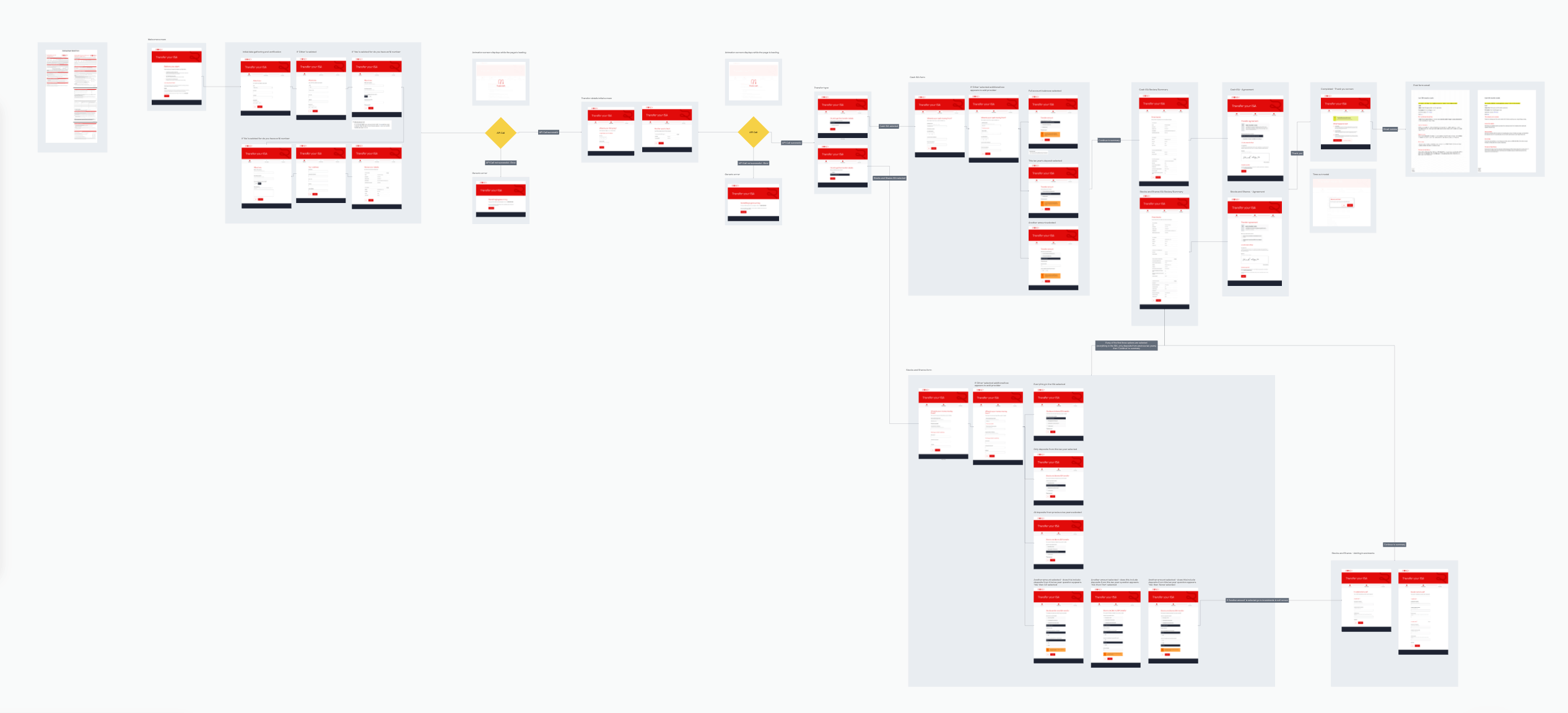
Above: The user journey from start to finish and email confirmation.
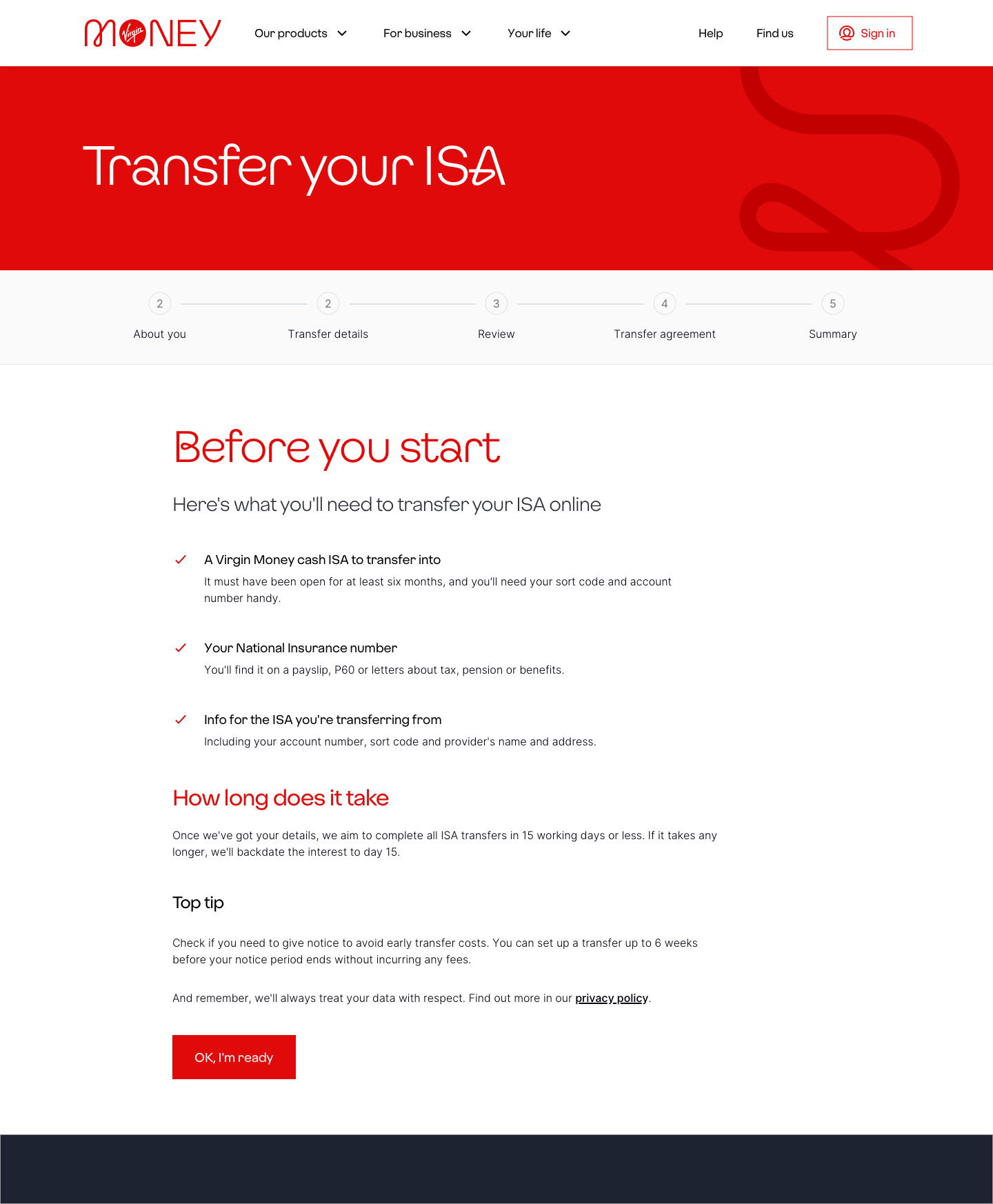
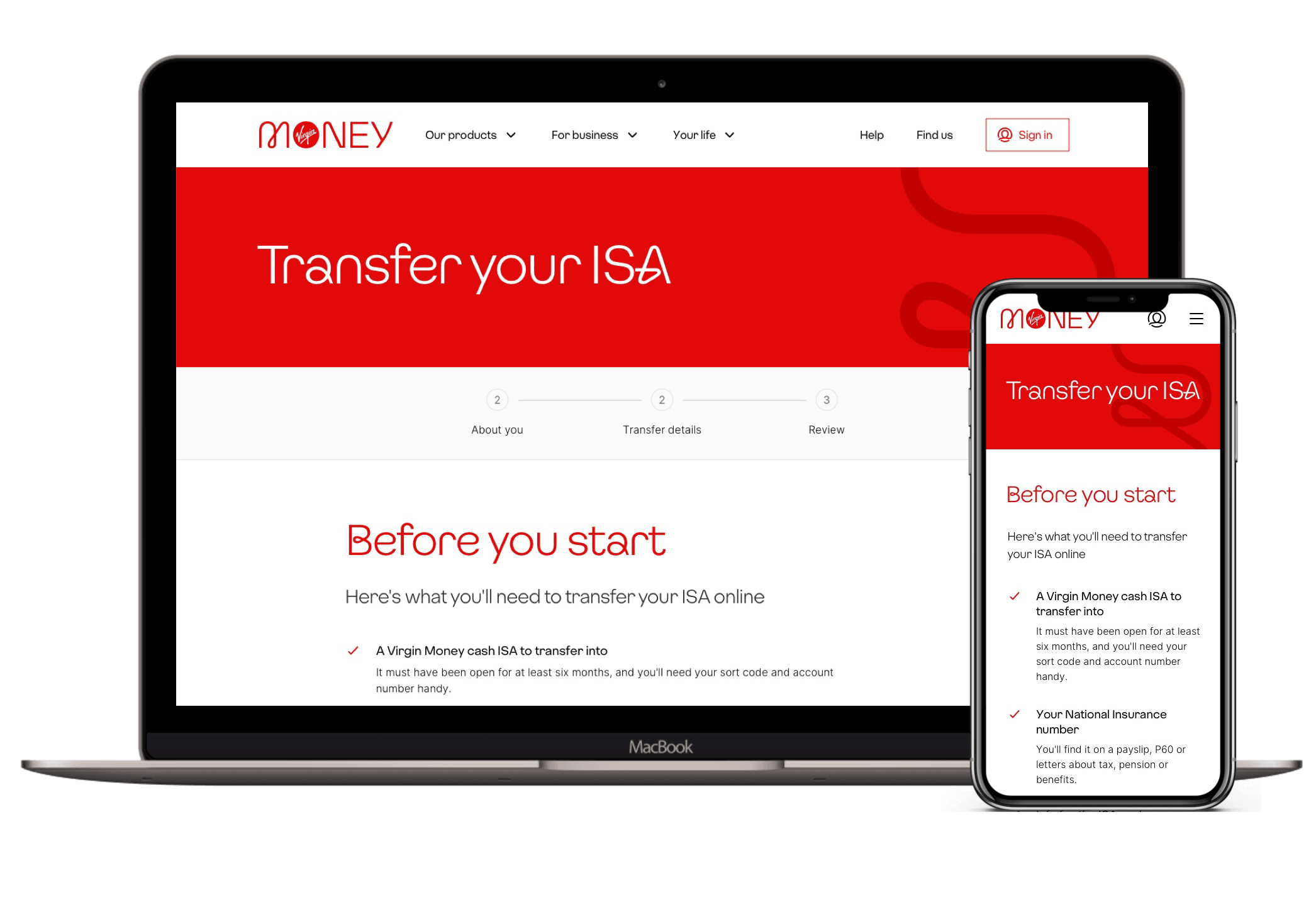
Above: The before you start page to make sure users have everything they need as well as how long their transfer will take.
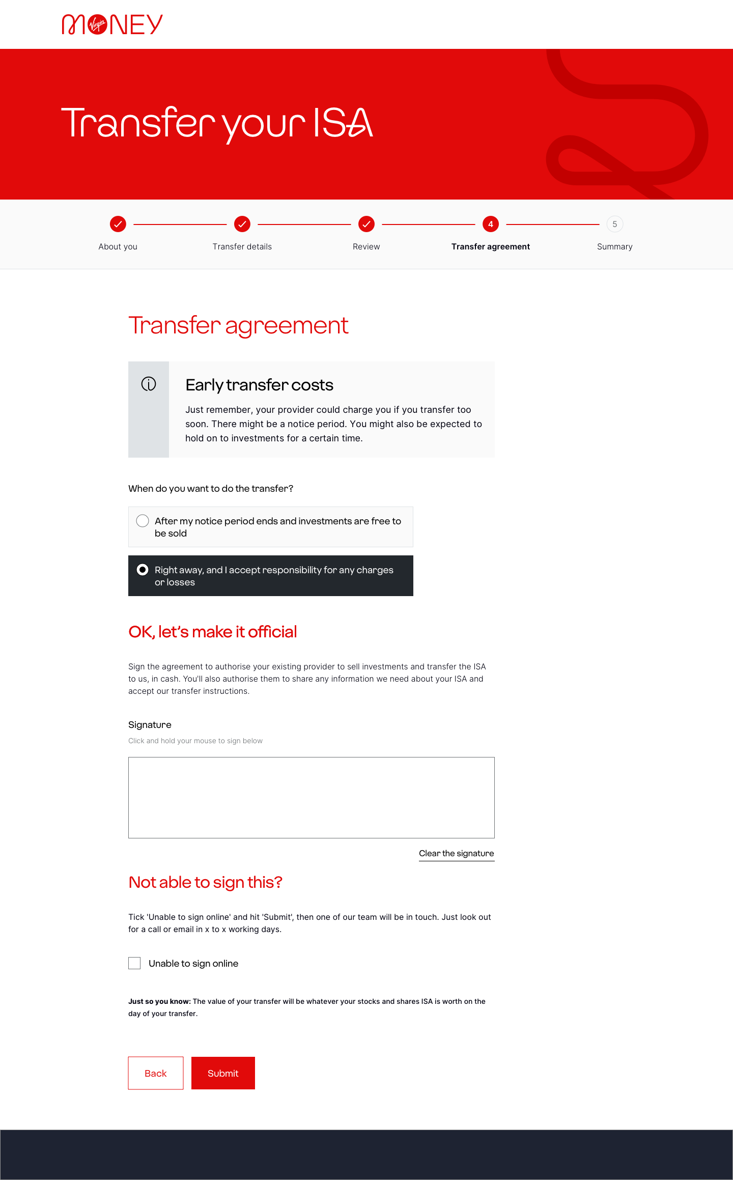
Above: The design we tested after given an example from the Design Leadership on the other place on the site we use an esignature collection.
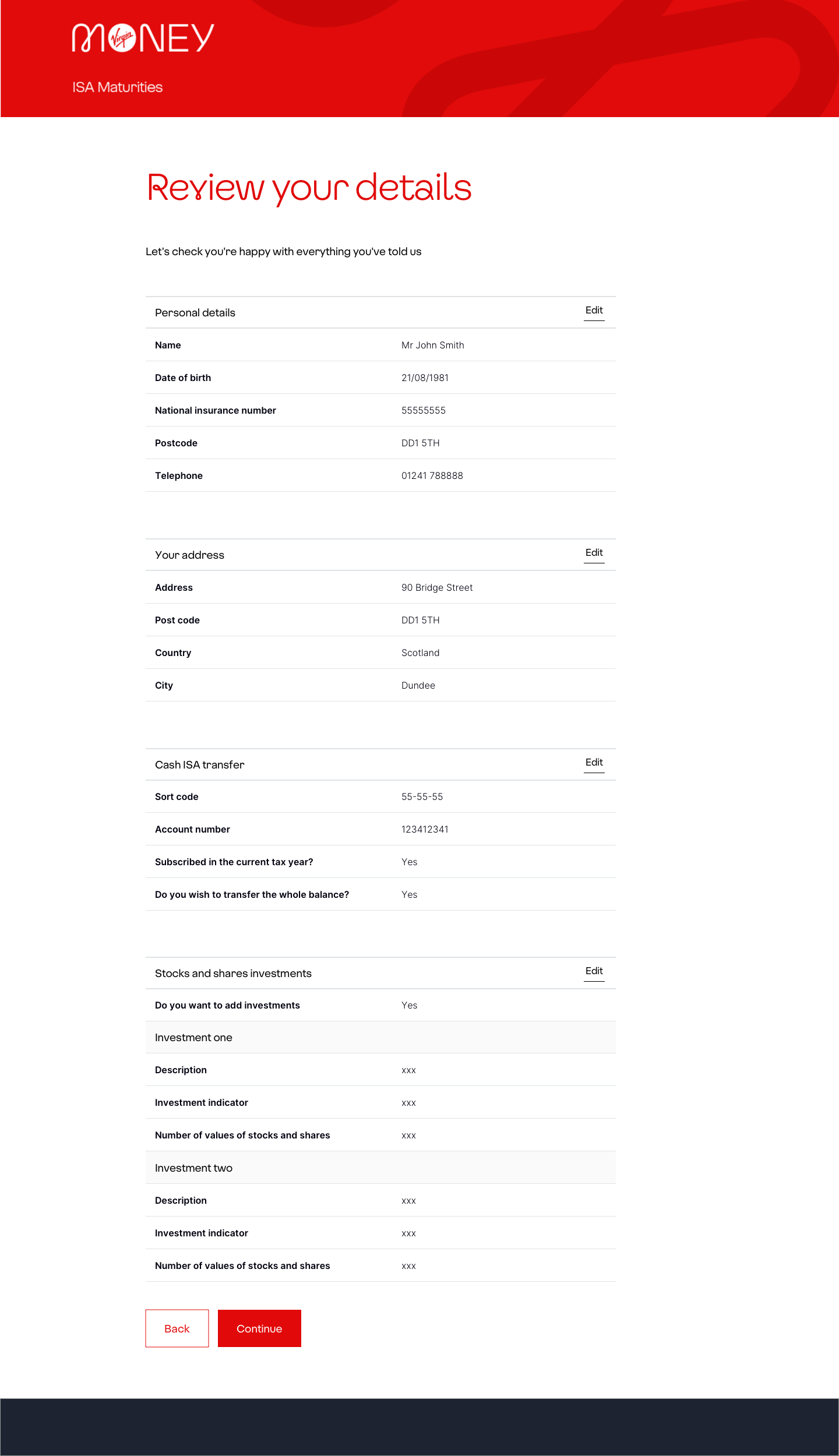
Above: The detail review screen from the Stocks & Shares journey to ensure users can review and edit their details easily if needed before continuing and submitting.
User testing findings
The Stocks & Shares journey including an esignature capture was something new to the bank that had only been done in one other area, so and we had some concerns on how users would find it especially with the need for their to be an alternate option for users physically unable to sign. So we setup user testing to see how users would interact with it as well as ensure some of the asks in the journey made sense to the users.
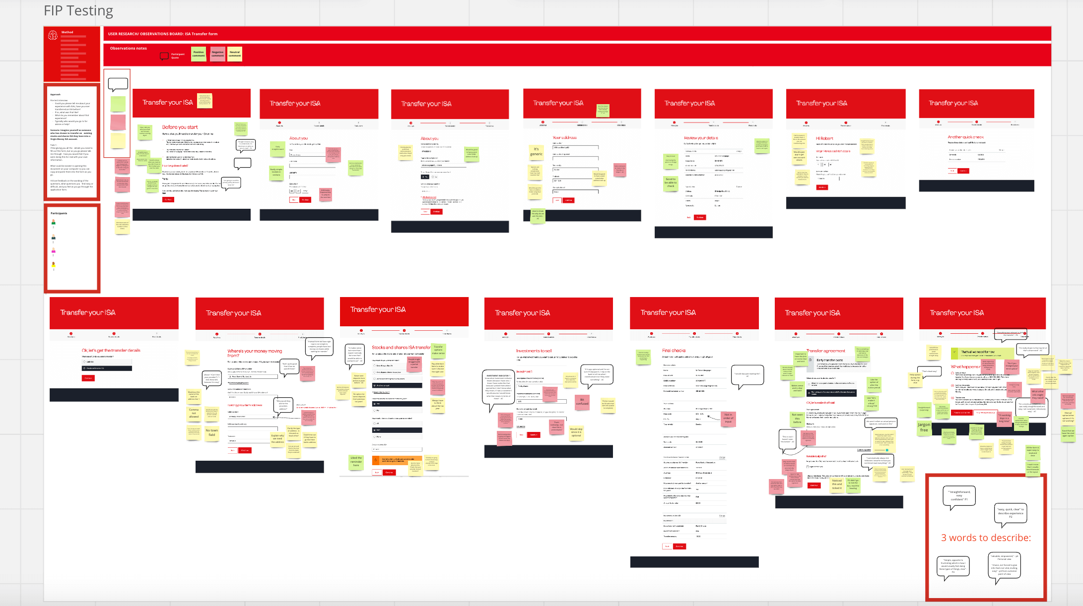
Myself and the Senior Content Designer sat in as observers for this user testing session to take notes while one of our Senior User Researchers conducted the sessions with participants. We noted positive, neutral and negative feedback, and observed for any potential difficulty or interactions that could be frustrating for the users or cause delays in the processing of their Stocks & Shares ISA transfer.
Results and learnings
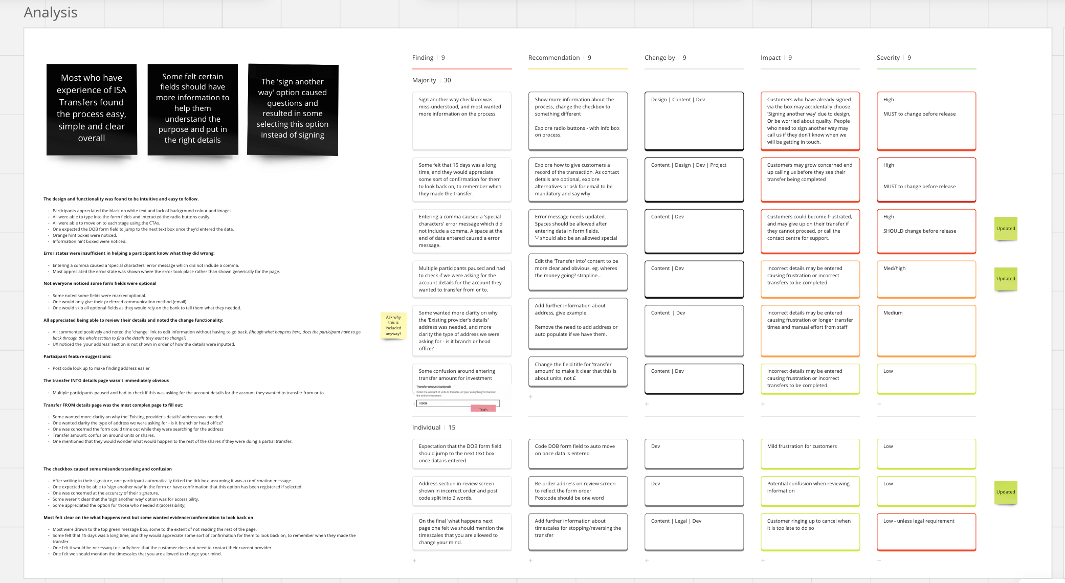
The user testing proved insightful, the general consensus was that the form was easy to use and complete. However, we identified a few key issues that we were able to rectify before releasing the MVP:
Transfer page
On the transfer page the user arrives to after verification of their details we originally had some personalisation in the H2 text to say “Hi name” then some supporting strapline copy asking them what account they were transferring to.
Typically when performing a transfer you would do from first then to. This caught out several testers who had to pause and double-check. We decided to scrap the personalisation and go with a clearer H2 “where’s your money going?” to ensure people don’t get caught out entering the wrong account.
ERROR MESSAGES
We had one user get caught out because they entered a space after their name and an error throwback asking to put in a valid name.
We had another one put a comma in the address which threw back a “do not use any special characters” error but the error message did not contain a comma in it.
We were able to fix both of these to ensure users didn’t get frustrated or give up and contact the call centre instead.
Signature page
We received an example of the other esignature page used in the other instance on the website from design leadership so we replicated it.
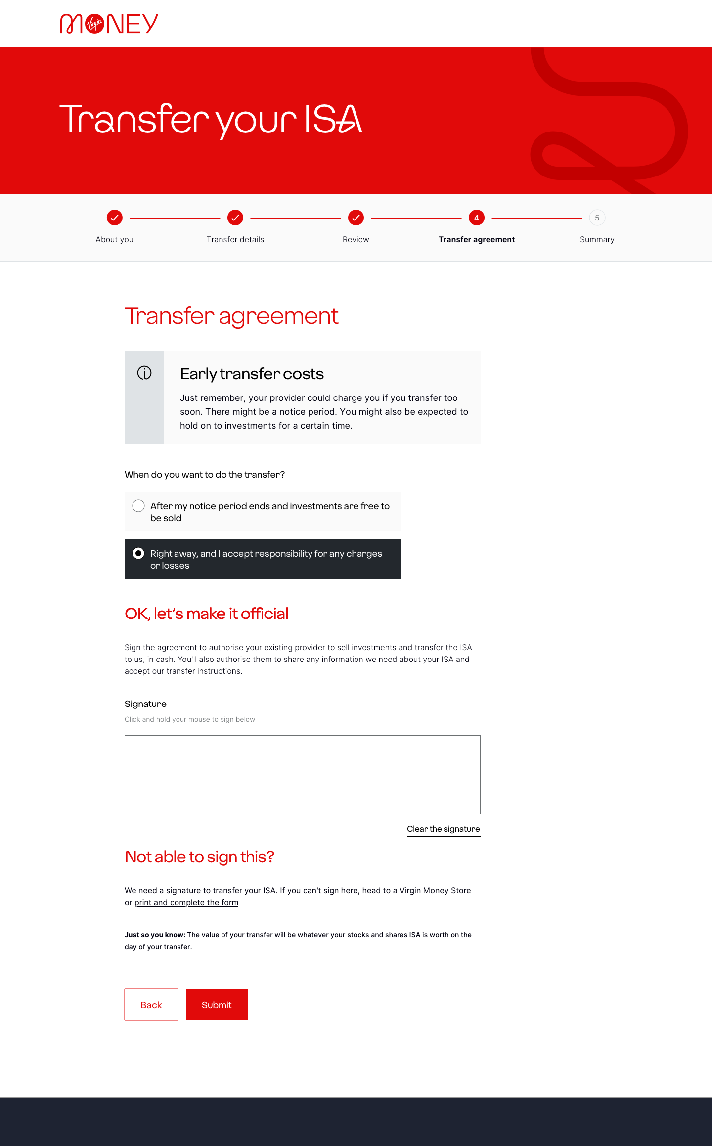
It was a signature box with a heading checkbox under it asking if they needed to sign another way which is for those with accesibility issues. However during testing this caused multiple issues.
- One user expressed mild anxiety of not being able sign accurately and wondered if this would affect the application so hit “sign another way” then the “Continue” button at the end of the page which submitted the transfer details – this was unexpected from the user who expected an alternate way to sign
- One user signed in the box, then ticked the checkbox as she scanned it and didn’t read and thought it was a “confirm you’ve read the T&Cs” and didn’t realise this cleared the signature box.
- Some noted the lack of information on what happens or how to sign another way
- Most able-bodied users did not realise this was for accessibility and assumed it was to serve them in an alternate way.
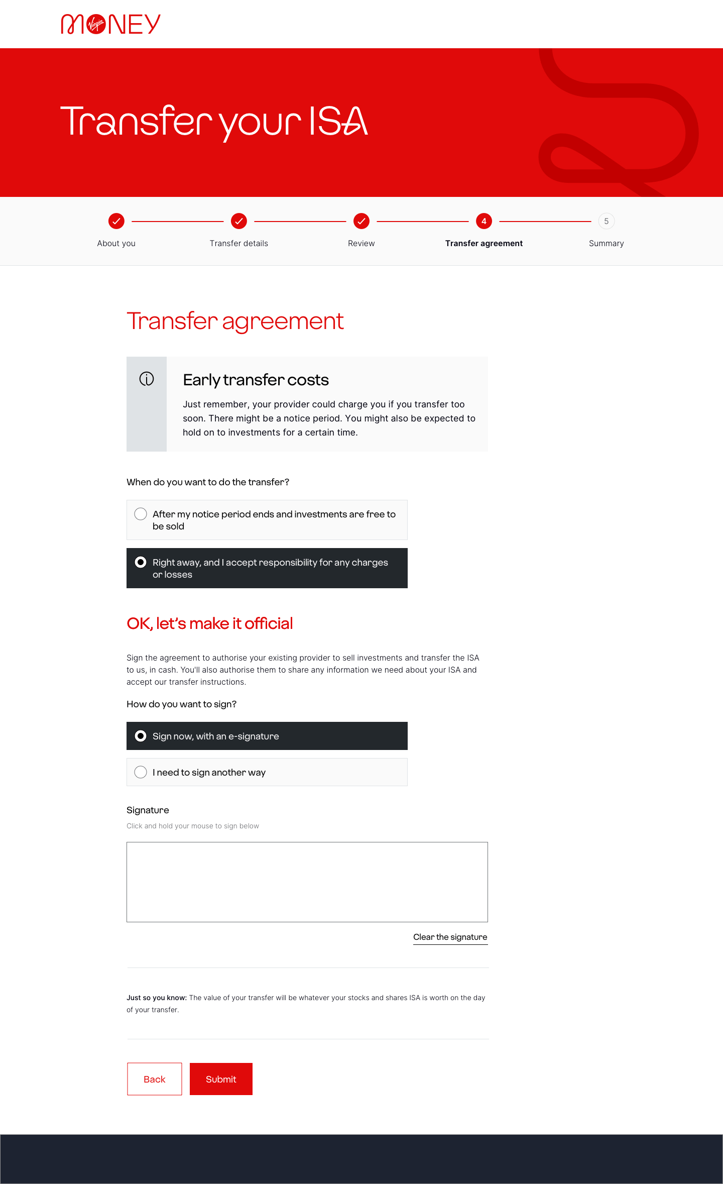
This was critical feedback, which we hoped would allow us change the design to include positive friction making the user select an option first to eliminate these errors. We also included information on how the sign another way would work.
Unfortunately, after much digging to get answers from the BAs, we don’t currently have a process other than printing a form and posting it or going to a store to get assistance. This of course would be extremely frustrating for users.
We also faced the issue that we were now in a code freeze in the build schedule and were only able to make small copy changes not design.
To combat these issues we added in an alert to the start of the prejourney which another squad handles when they select how they would like to proceed to let them know they’ll need to provide a signature.
This will help them by either knowing they may need their proxy there to sign for them at the end, or they can choose an alternate process at the start. We then had copy at the end of the signature page as a final catchall to tell them the alternate process they would need to take instead.
We do hope for the next iteration we could use the positive friction radio button option.
The final page for Stocks & Shares transfer MVP with an eSignature capture. Originally this design had a checkbox (seen above) which caused several issues during user testing so this design as it came to light the back end process for those ticking the checkbox resulted in a letter being sent to say they need to go in store or print. This was a BAU process we were unable to get changed, this seemed pointless and frustrating and leaving in the checkbox left in too much potential for error and a bad UX so we deleted it and put it upfront.
My other concern was leaving it in and they downloaded a form and posted it or went in store but they also ticked the checkbox, we couldn’t get a timeframe for when the letter would be sent so potentially they could have completed this process which takes 15 working days, and in the meantime get a letter it was rejected so I ensured we removed this checkbox and backend function.
This is the design we originally settled on after the testing with some included positive friction by employing a radio to display either option. We hope in future we can improve the process for those users who are unable to provide an electronic signature.


