Virgin Money UK OVERdrafts
One of my projects at Virgin Money UK as a Senior Digital Designer (UI/UX) was taking over an update to the overdrafts page from another designer. There was a change in requirements which lead to a lot of design research to ensure we could get this process right for customers as well as fulfilling our legal and compliance duties to consumers.
arranged overdrafts
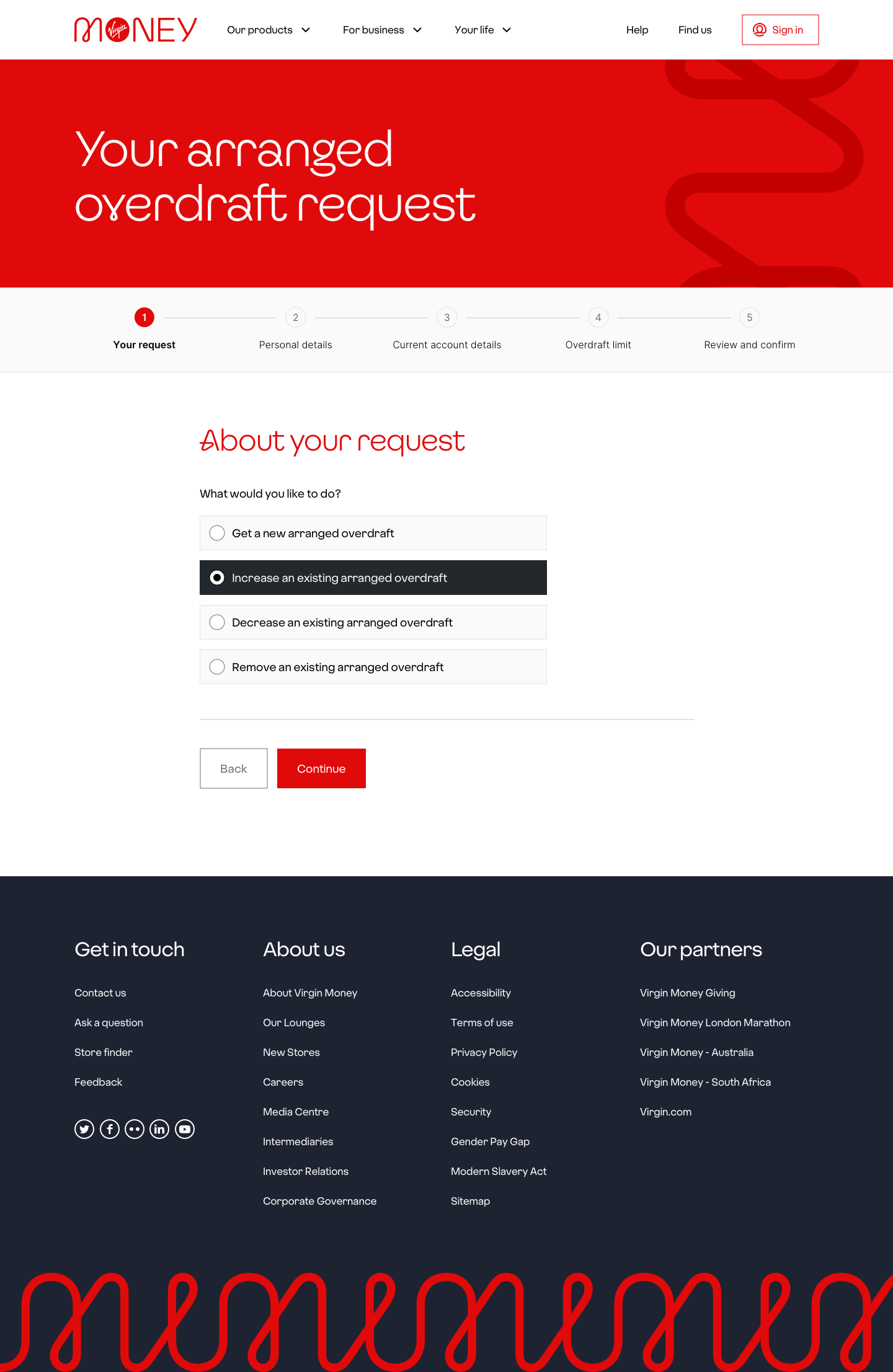
A brief came through to improve the arranged overdrafts process at Virgin Money. We created a journey to either apply for a new arranged overdraft, increase, decrease or remove an arranged overdraft. We then get their personal details and account details to match their account.
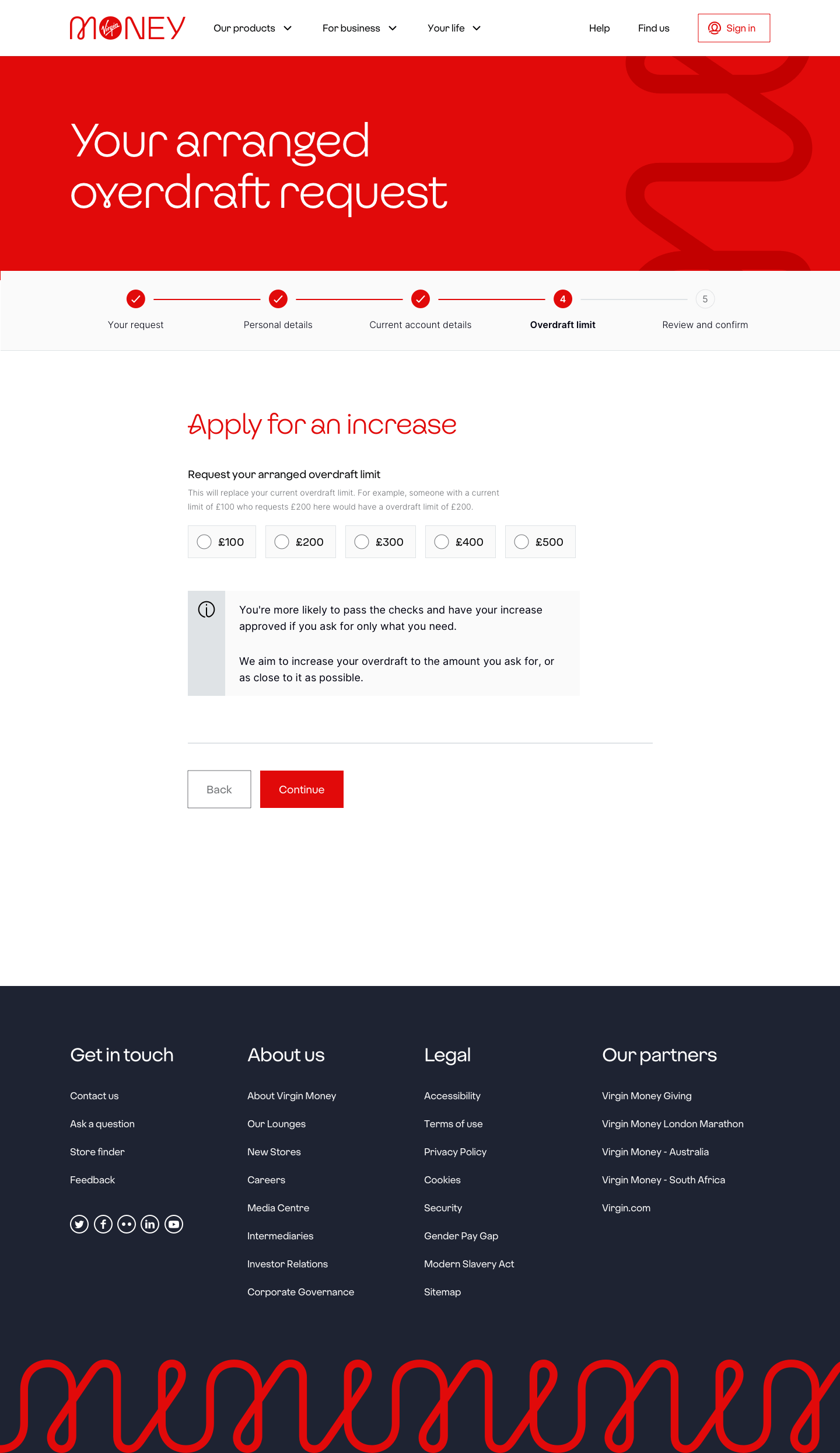
Business requirements originally came through to offer overdrafts online up to £500, in £100 increments. Originally, a design was chosen to clearly show these amounts upfront with 5 radio buttons ranging from £100 to £500.
Later when I stepped in on the project new business requirements came through to change the increments to £50. We now had nine option to choose from, and going from five to nine radio buttons would be too overwhelming, so I came up with some new design options.
Research
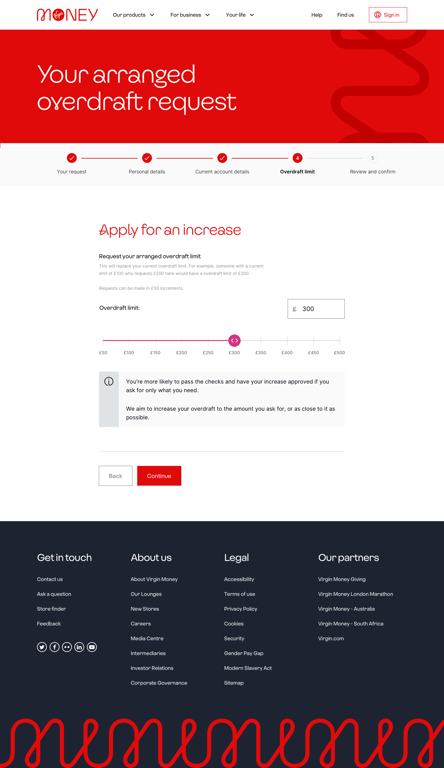
Doing a landscape review on competitors, I looked at some other leading banks who are noted to do digital very well including Starling Bank, Chase and Monzo. I noted that they all utilised a slider component for desktop and mobile, this was an option I explored, however I had concerns about the native iOS and Android functionality as they both have a back and forward swipe feature on the browser, a slider component could easily trigger going back to the previous page and could cause mild frustration to the user.
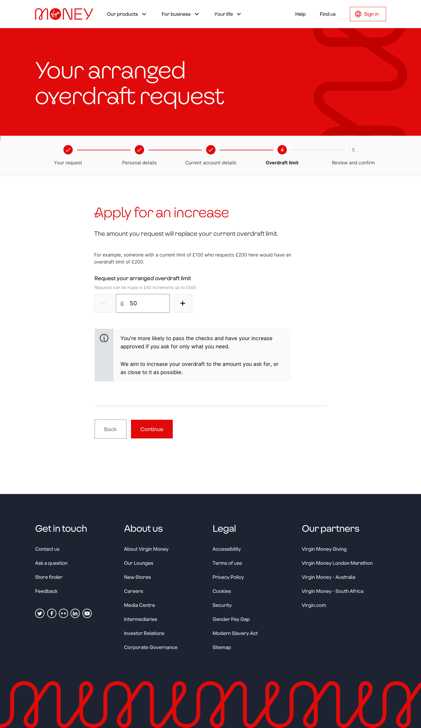
During internal testing, as hypothesised the slider was causing some issues sending users back to the previous page. The other option was to include an “input stepper” option where users could tap minus and plus buttons or input the amount they wanted.
automatic rounding debate
Following on using this design, my intention was to automatically round the amount input to the nearest £50 if someone entered a different amount. I also wanted to display an alert to notify the user what as happened so they don’t end up getting an overdraft for a different amount they weren’t expecting, and avoid potential compliance and legal issues for the bank.
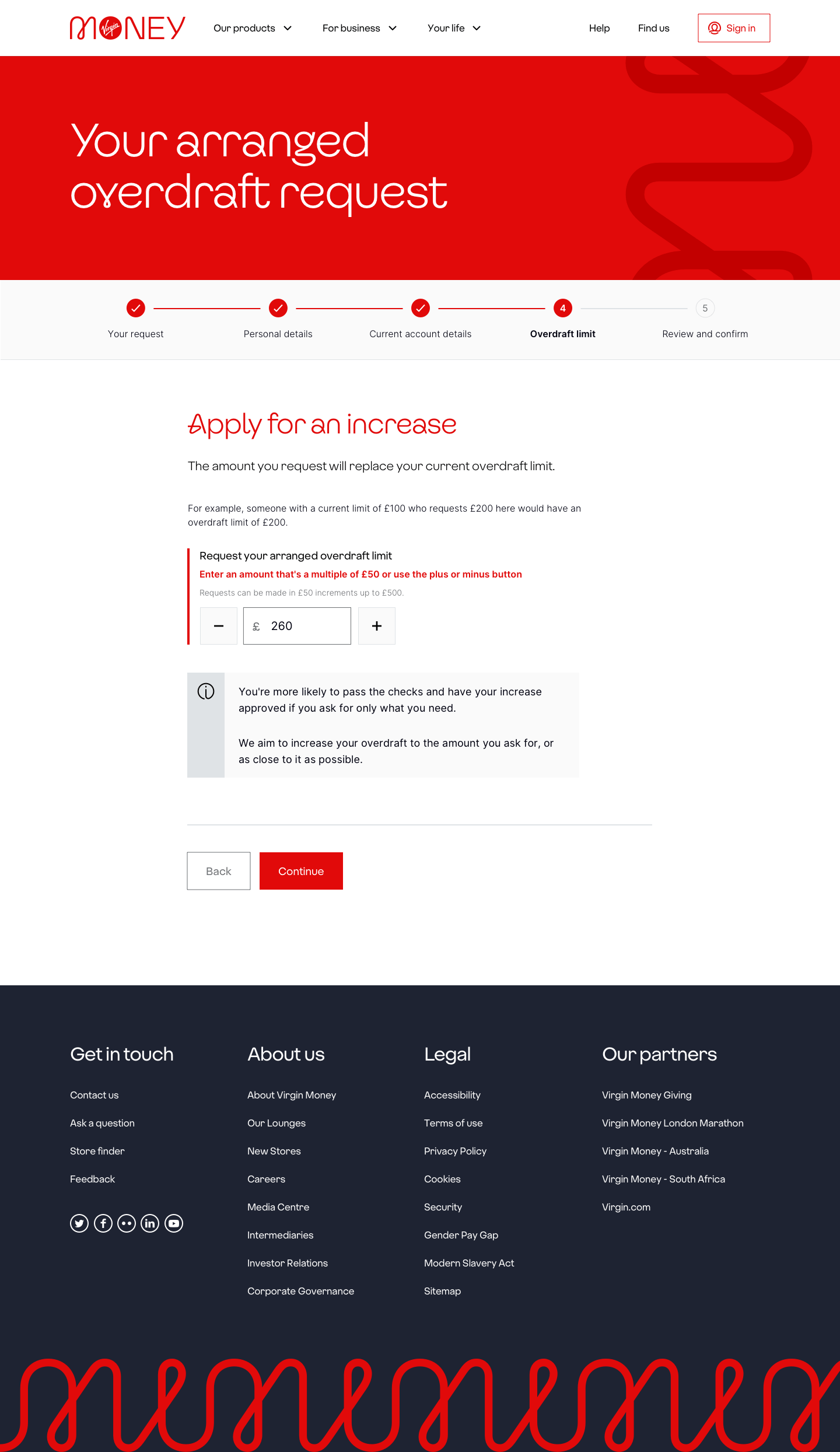
However during development, it wasn’t possible to display an error field if an amount such as £260 was enterered as the field would automatically round down to £250 and be valid and would not display an error. We risked the hazard of people not noticing and taking away autonomy whether they wanted to round their amount up or down.
In the end we settled to disable the automatic rounding and have the error state appear on the field. During testing we observed users instinctively using the plus and minus buttons to adjust their request and overall we were happy with this user experience which informed the user appropriately.
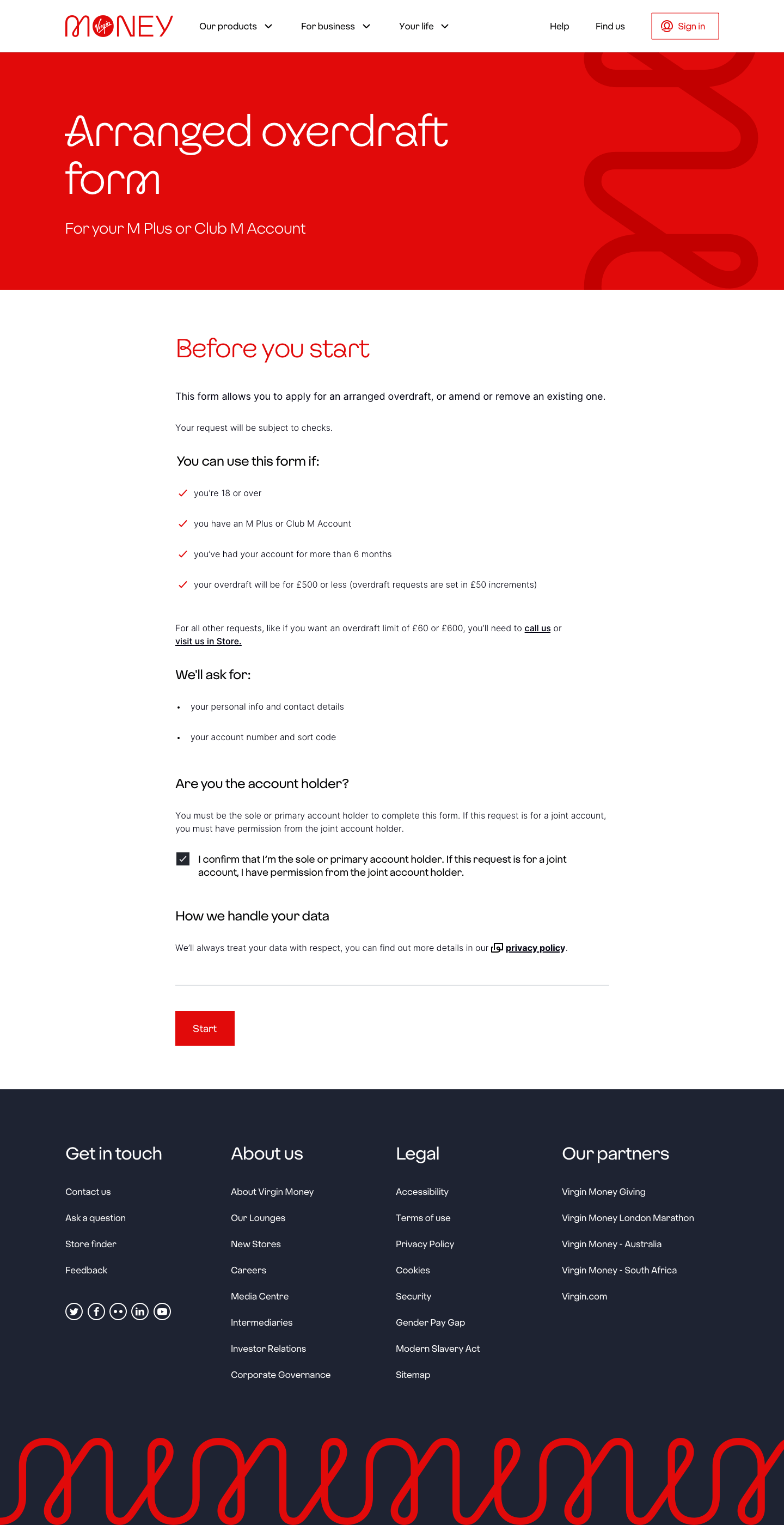
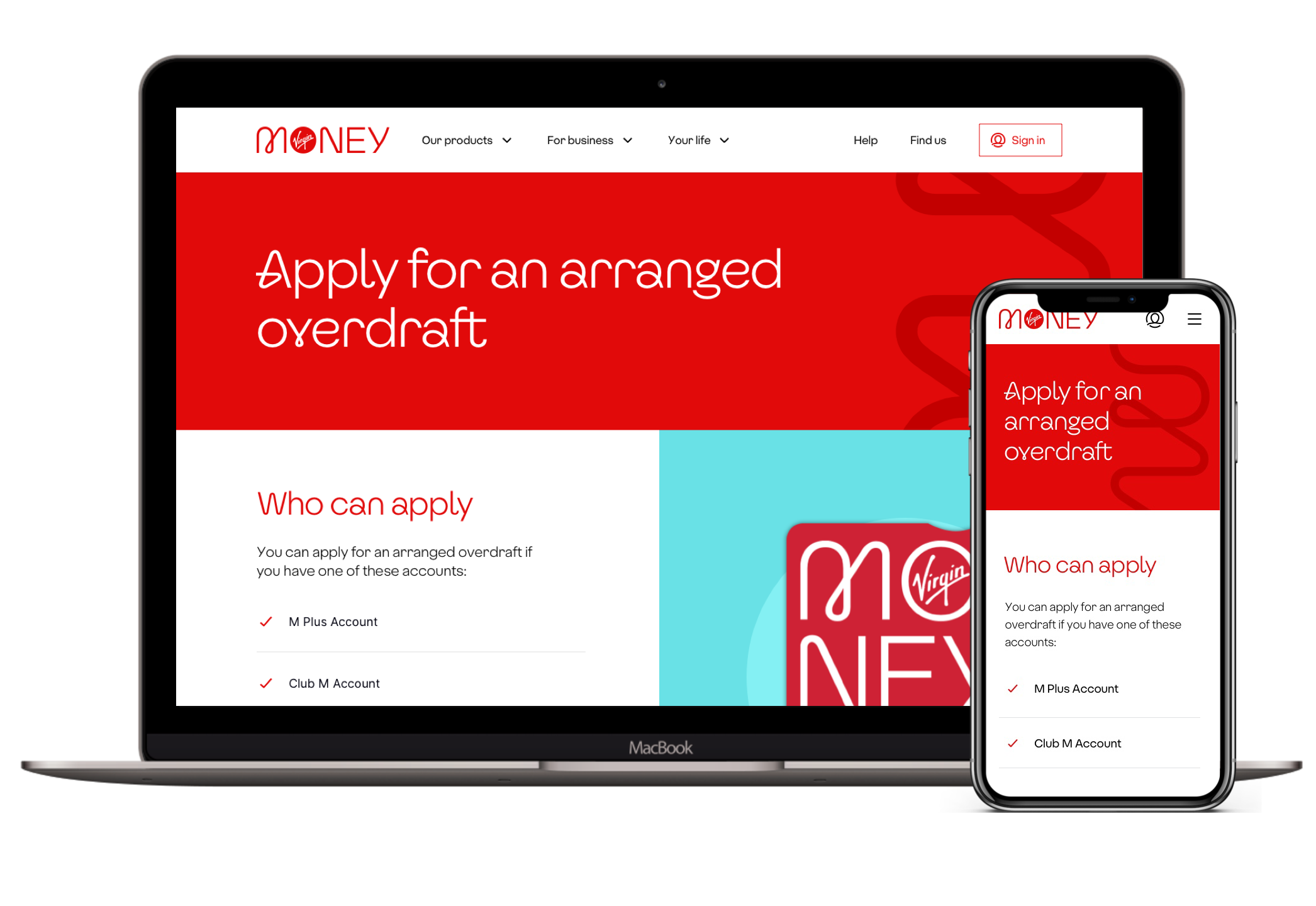
Above: overdrafts landing page design.
Below: The original overdraft limit page with 5 options as radio buttons
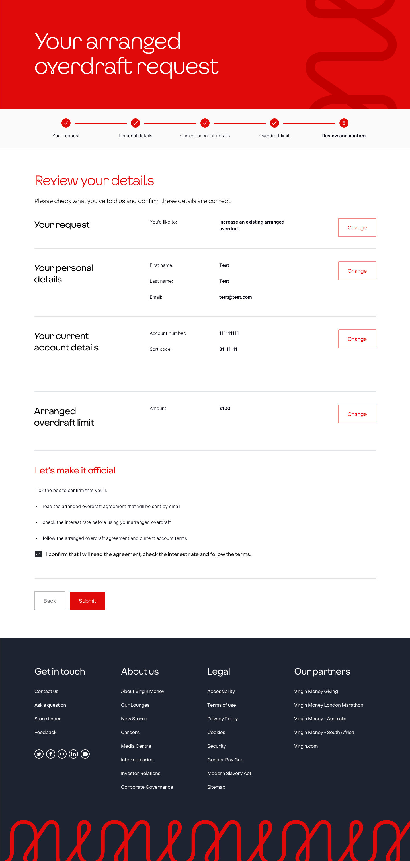
Below: Request details for users to review and edit
Below: the slider option explored on desktop, while visually engaging it’s functionality wasn’t great on mobile.
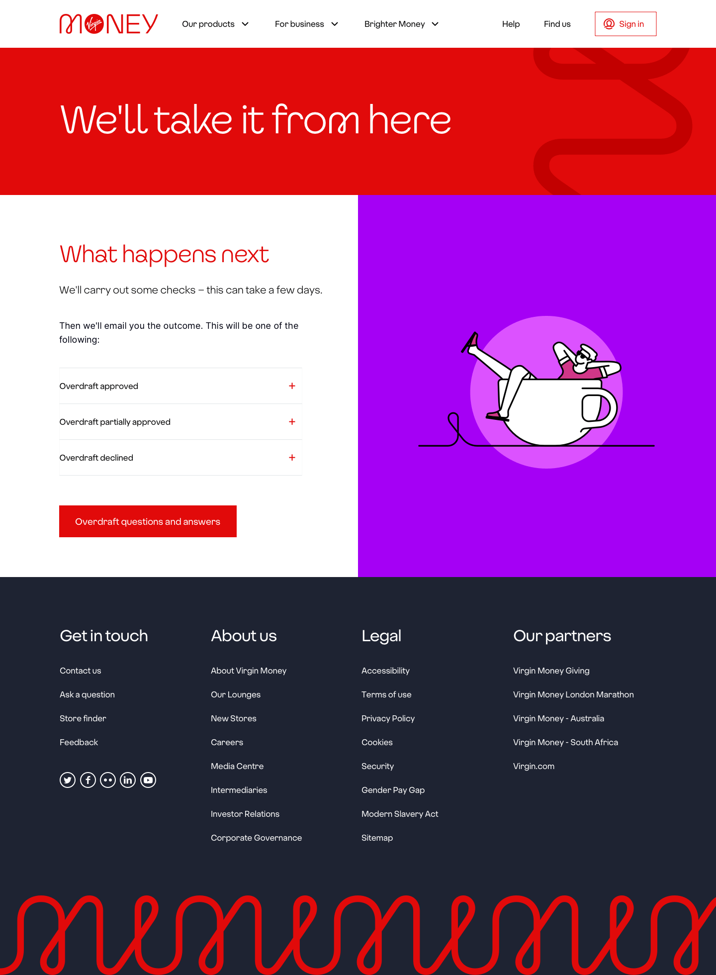
Below: the post submission page with info on what happens next
Below: New design with an input stepper with nine options which reduces choice overwhelm compared to radios, and works well on mobile.
Below: one of the error state messages to alert users to round up or down and giving them the autonomy to do so to suit their needs.
Below: the slider option explored on mobile, while visually engaging it’s functionality wasn’t great on mobile, and we lost labels due to lack of space making it harder for the user to see.


