Virgin Money UK paper-free app journey update
One of my projects at Virgin Money UK as a Senior Digital Designer (UI/UX) was to work on the Virgin Money personal banking app. This update included reworking the user journey and adding in new components to encourage users to go paper-free, as well as a post launch update to encourage people to stay paper-free who were considering switching back to paper.
paper-free journey
A brief came through to improve the arranged overdrafts process at Virgin Money. We want our customers to be paper free. It reduces waste. It saves the bank money. It promotes a digital first mindset with customers.
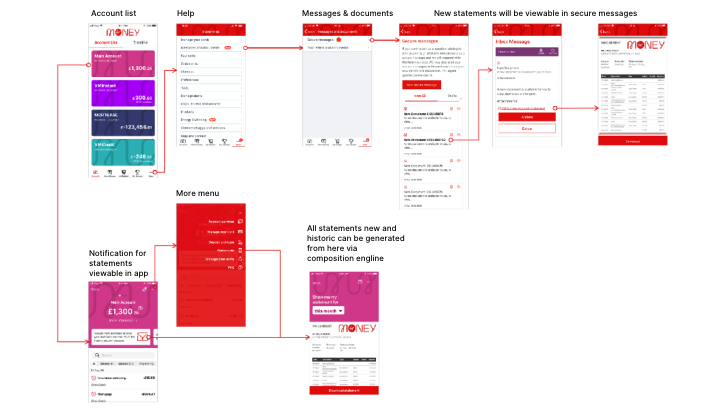
The personal banking app (PCA) already provides statements to customers, through a ‘composition’ engine. This takes a list of transactions from the app, adds a header and styling to make it look like a statements, and users can download the newly created document as a pdf.
Updates we needed to accomodate/include:
- Send statements to a customer’s secure messages in app. These statements will be digital copies of the statements that would have been compliant.
- When a secure message is surfaced, trigger a specific statement email. This will be sent to the customers’ registered email address.
- Turn paper preferences for selected PCA customers to ‘paper-free’. This will enable digital statements and suppress paper statements.
- Overhaul UX and UI of messages & documents to bring it into line with the rest of the PCA app.
- An accompanying comms plan to let customers know that they can see their new statements in the app.
Above: flowmap with a widget informing users where they can now view their paper-free statements/go paper-free
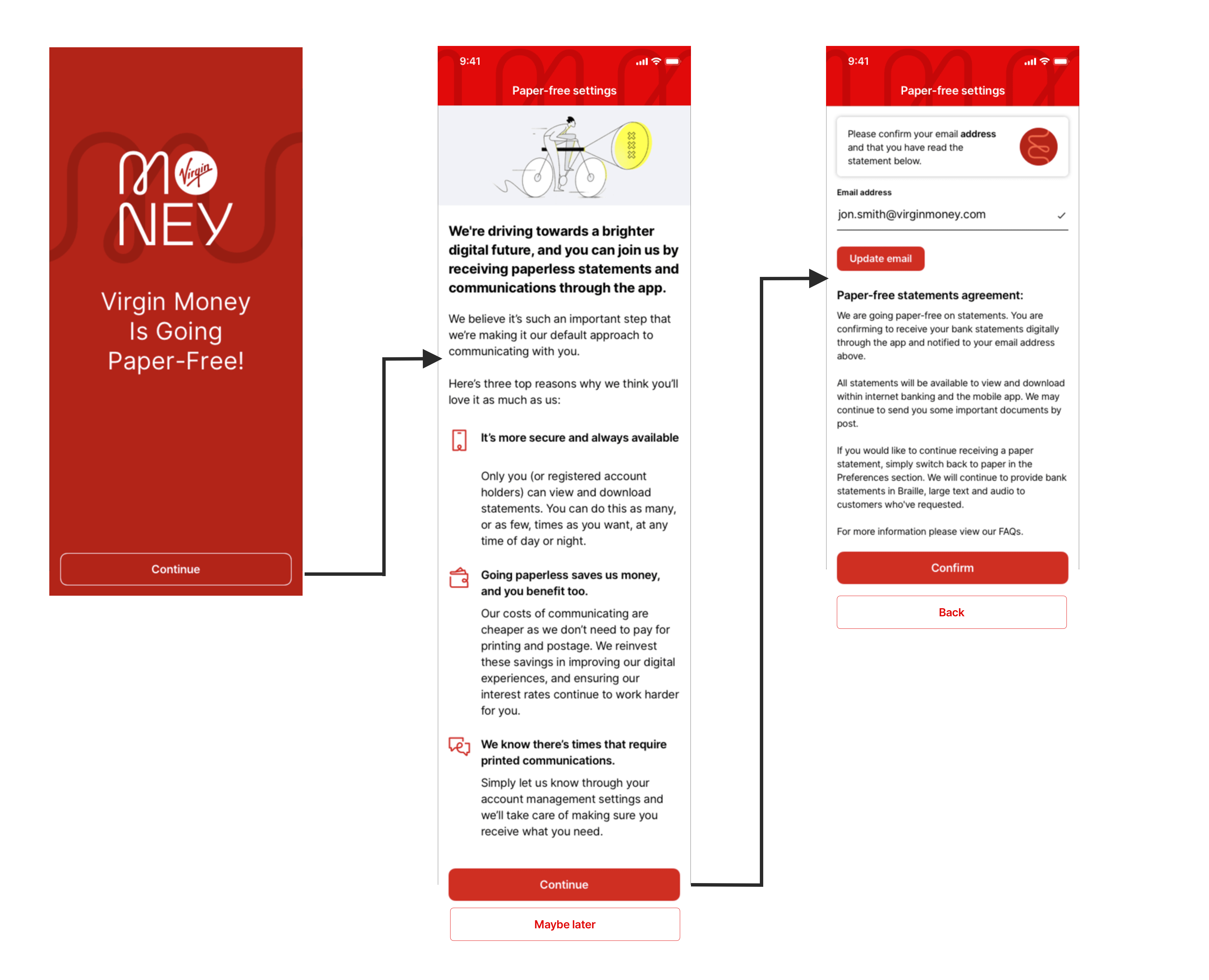
When users first open the app with the new update a takeover screen appears which leads the user to read about the paper-free offer.
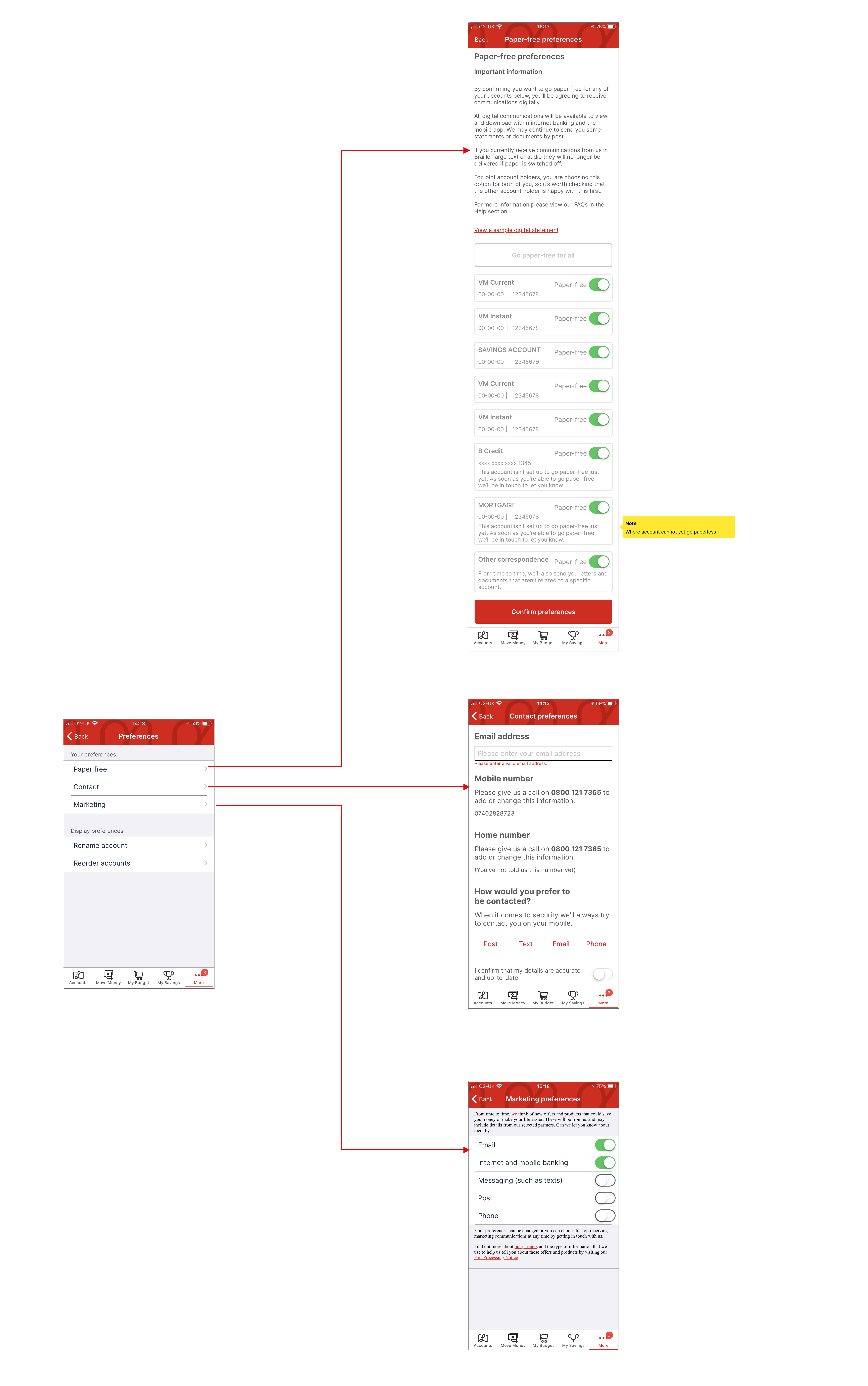
Diagram of various setting in preferences with the new paper-free section where users can toggle on and off
paper-free journey post launch
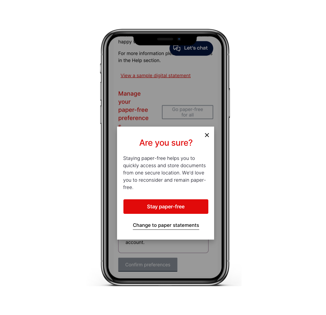
The new paper-free option was well received by most users, but of course there are circumstances where people may want to stay with paper statements. To encourage those who may not need paper trying to switch back to paper statements from paper-free, we wanted to include some friction to dissuade users from doing this.
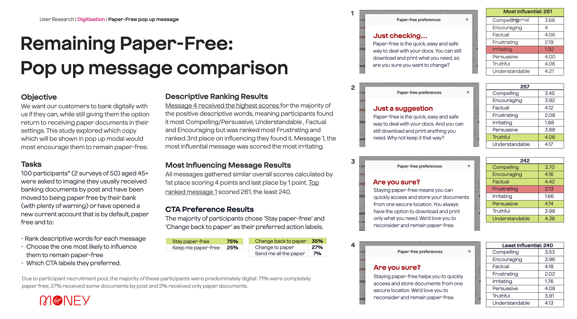
As this was quite an important piece on the app we engaged with the User Research team to test some messaging with one of our customer panels to get the right wording that wouldn’t be irritating and importantly encourage people to stay paper-free.
Looking at each option we tested variants for the CTA where we had a clear winner. We had some interesting results with the messaging. The most influential message was scored most irritating. So we decided to combine the messaging to create an influential and persuasive message that was not irritating to read.
Below: The paper-free preferences page where users can toggle which statements they want in which format. If a users toggles a paper-free toggle off when they click confirm preferences it triggers to pop-up to ask them to reconsider. This pop-up performed well to encourage users to remain paper-free and reduce the amount of customers reverting to paper with 12% of users seeing it opting to remain paper-free.
