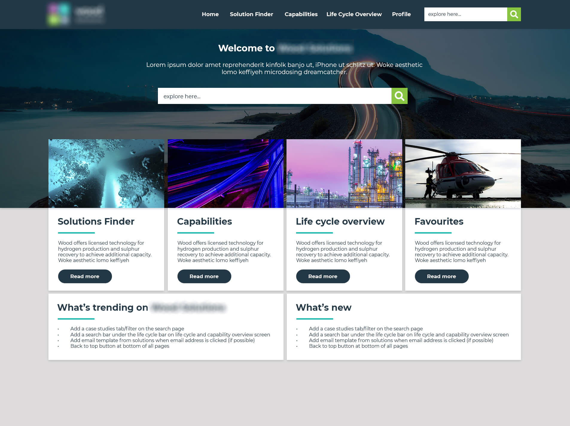
wood saas tool
During my time at Wood, a company with 55,000 globally as the Web Design Lead (UI/UX) I worked on this large scale UI/UX project with our software development team to be rolled out company-wide for our Business Development community and Engineers who consult and liaise with clients. Due to this project being an internal product and being bound by an NDA, I cannot share the full details of this project but I will endeavour to take you through the thought process and journey of creating this tool.
The goal was to create a tool that will enable customer-facing employees to access information and contacts that will help them navigate the Wood organisation to bring additional solutions and new value to our customers.
Role on project
UI/UX Design Lead
User Research, Information Architecture, Interaction Design, UI/UX design, Prototyping, conducting User Testing/Interviews, Workshops, Design System creation and management.
“In our time working together, Amber took responsibility for the visual elements of a company-wide solutions portal, taking the concept from simple wire-framed sketch to a fully realised attractive and intuitive user interface. Along the way she managed the input of multiple high profile stakeholders; encouraging their ideas, incorporating those that offered the most value and (perhaps most impressively!) gently and delicately guiding them away from those that would have compromised the ultimate quality of the delivery. By the conclusion of the project, it was abundantly clear that Amber possesses the drive, talent and vision to be a key contributor to any project or organisation.”
– Josh Goolnik, (former) Technology Manager at Wood
Product vision and MVP
The product vision was developed by a team of about 15 people including Business Development Leaders, Software Engineers, eLearning Developers, Software Developers, and myself as the UI/UX Lead for the project based on the requirements from Executive Leadership Teams and Presidents.
In order to launch an MVP, we created a listed of features that had been requested and ones we thought of as a team that would add value to the tool. We then bucketed them into groups:
- Must-haves for Phase 1 launch
- Would like to have but not launch critical
- Nice to haves
- Future phase items
We worked in agile sprints that were 3 months long, so collectively agreed and assigned items to the launch phase, phase 2, phase 3 and 4. Some items were also dependant on the success of the tool and feedback from users once launched.
Defining and understanding the user needs
One of the biggest things we had to be mindful of when creating the tool was not to lean into a focus on oil and gas as the company has traditionally done in the past. The company went from 90% of its business being oil and gas to 35% in the last 5 years, however, the shift of mindset/focus to our other products such as renewables and tech has taken a while as oil and gas is still a big part of the business.
Therefore, sometimes people in the company can feel a bit “left out” if their speciality is outwith oil and gas. We were mindful to create a tool to cater to a range of people in the company including Business Development Managers, Engineers, Subject Matter Experts, Analysts and Account Managers.
We ascertained that our customer-facing employees need to;
- Understand more about the breadth of Wood’s global capability
- Understand where it can be applied across an asset life cycle and how it brings value
- Know how to find the right person to contact for that capability
- Know where to go to find information on that capability
- Understand customer issues as an opportunity to position additional Wood capabilities
Interviews and creating personas
I conducted a range of interviews in the early stage of the tool with some clickable wireframe prototypes to not only validate the project idea, but to gain valuable feedback from different users on what they liked about the idea, what they feel was missing and what they’d like to see that would be relevant and useful to them. From here I created several personas and linked tool features that would be useful to different users.
One of the biggest takeaways from the interviews was validation of the idea to include a contacts section. As a global company with 55,000+ employees, operating in over 60 countries and over 400 offices, often it can be hard to know who is the best person to contact. We developed a contact system to give users several useful contacts and tagged them by location, title, and whether they were a lead for that market/sector.
I then conducted further interviews using a high fidelity mockups with the same and new users to gather more feedback and observe how people were using the tool and whether they were understanding how to use functions such as accordions to open and expand information. I then conducted further testing with a beta version of the product.
After an introduction to make sure they understood the purpose/goal of the tool, I asked a set of questions and recorded the answers on my laptop as they interacted with the tool:
- Do you have any questions before we start?
- Please spend a few minutes navigating the tool like you normally would. Feel free to talk us through your journey on the tool, let us know of any friction points and if something does not work as expected.
- What would you expect to be able to do with a tool like this?
- Was there anything missing you would have expected or liked to see?
- Please explore the homepage. What are your thoughts, is it clear/understandable/useful? Why or why not?
- What device do you see yourself using for this tool?
- List out 3 things you dislike about the tool.
- List out 3 things you like about the tool.
- What would you change?
- What was your overall impression of the tool?
Tool Mapping/Wireframes/UI
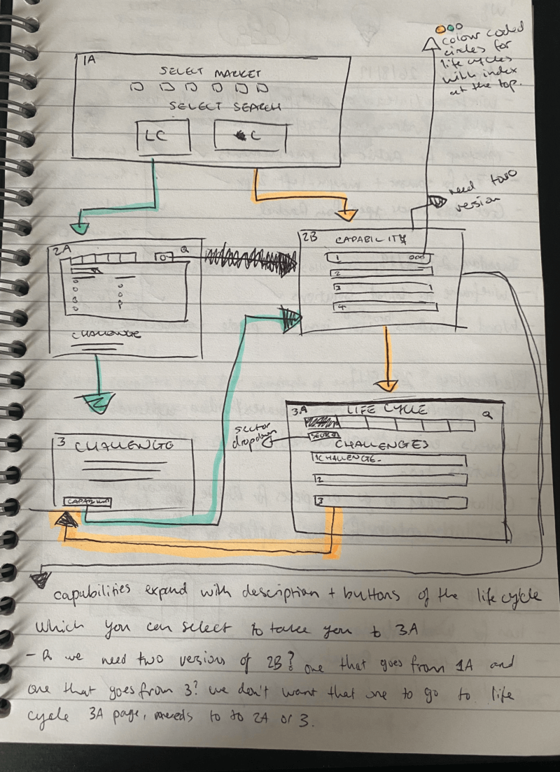
We first started with creating a sitemap for the tool and adding in top-level navigation and then subpage navigation and working out what pages link to what. It was quite a complex tool with various ways to use it and search journeys – by searching via the lifecycle stage of an asset to see what could be applied at a particular stage, via a capability to see where that capability can be applied to, search via text and on a search page to tag by “all” “solutions” “challenges” “capability”. Phase 2 of the tool also saw us add in searching via digital and technology to see what could be applied to what.
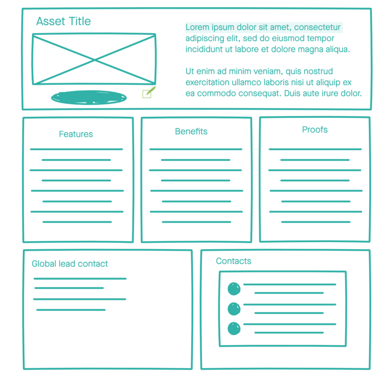
The wireframing process started with some rough sketches in my notebook to quickly visualise how the user journey should flow, and how to best represent the different parts of the tool. I then moved onto wireframing using the InVision Studio app so I could create clickable prototypes to share with stakeholders and gather feedback and explain the UX rationale.
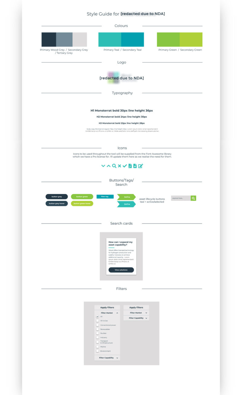
I then worked on creating the UI of the tool and a design system to be applied based on our existing branding, and creating CSS libraries for the development team to use, including interaction design/hovers.
Results and learnings
After compromising and additional requirements from stakeholders resulting in the product launch taking longer than planned, the beta version of the tool was launched to a select group of users, which garnered great initial feedback. After some minor revisions and bug testing, the tool was launched to the wider community. The tool has a lot of people excited, they expressed how they see the value of the tool aiding them in their roles to help customers with certain challenges they’re facing, learn about additional offerings the company provides that may be useful for their customers and to increase company revenue.
I documented the process, interviews and iterations of the tool as it developed. It was really interesting to see the initial concept and ideas evolve. One of the hardest things during this process was managing stakeholders who did not have any design background or experience adamant on creating bad design decisions. There was a battle for me to be able to include a proper homepage/dashboard (yes can you believe it!) that took some serious convincing, among a few other odd suggestions that were being pushed. One of the biggest things I’ve developed personally on this project is how to better manage people and steer people in the right direction by politely asking them to validate their design propositions in detail – most of the time there wasn’t a viable answer so I found this a useful tactic to redirect their focus to a more suitable idea backed by design rationale I presented.
